The Lampshade That Started an Argument With My Living Room
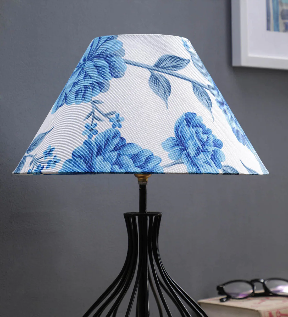
Not a real argument — more like the quiet, persistent kind where you rearrange things slightly and then stand back frowning for twenty minutes. I bought a blue patterned lampshade before deciding what to do with the curtains, the rug, or any of the larger soft furnishings around it. Which, in hindsight, was doing things in exactly the wrong order. The shade was genuinely beautiful. Deep marlin blue with an ikat print, a 40cm tapered shape that sat perfectly on the side table base. But placed against the wrong backdrop, even a well-chosen lampshade can look isolated rather than intentional — like someone dropped it into a room it does not quite belong in. Matching it with everything else took thought, a few wrong turns, and eventually a fairly simple set of principles that made the whole room click.
Curtains Work Best When They Borrow Rather Than Copy
Most people have an innate desire to match the curtains perfectly to the shade—that is, the same colour, tone, and depth. This is rarely as good as it seems. When two components in a place are exactly the same colour, neither one draws attention to itself nor helps the other. They merely fight for the same area. Softer, grayed-down blue curtains, such as steel blue or pale denim, allow the light to carry the stronger note while the curtains provide a visual mirror that unifies the room without overpowering it. Alternatively, drapes made of soft natural cotton or warm linen with a gentle blue thread running through them achieve the same effect without any overt colour matching. Although it doesn’t make a statement, the connection is clear to those who look.
Rugs Are Where Most Rooms Either Win or Lose the Game
A rug is frequently the largest piece of furniture in a living room, and its effects on the lampshades above it impact the entire space. A blue-patterned rug establishes a vertical link between the floor and the lamp, which acts as the primary center point of the area, even when utilised as a secondary or accent colour. Because the stacking of print types creates visual interest rather than confusion, the Leaf 30cm Tapered Shade in Shell Bay Blue or the Ripple 20cm in patterned blue look great over rugs with geometric or floral designs. Avoiding pattern overload is important; if the rug has a lot of designs, the light should have a simpler print. If the rug is more restrained, a bolder shade pattern has room to breathe.
Sofas Set the Temperature the Shade Needs to Respond To
Blue lampshades look clean and modern on a cold grey sofa. The same shade appears softer and more traditional on a warm cream or brown couch. A grey sofa creates a difference that appears planned and thoughtful by giving the blue something to push against. Because the silk treatment gives a richness that keeps the blue from reading as chilly, the AARTIN Blue Silk Straight Empire hue works especially well in areas where the sofa has a soft tone. The link between the sofa and the shade is more about matching temperature than it is about matching colour; rather than pulling in both directions at once, the total space should feel either constantly warm or consistently cool.
The Room Tells You What It Needs If You Listen to It First
Before making any adjustments, take a seat in the space and assess what is presently there. You can tell what style of lampshades will feel at home and what kind will seem brought from someplace else by looking at the colours already there, the textures already operating, and the light streaming through the windows.